LVGL Layouts

Layouts aim to position widgets automatically, eliminating the need to specify x and y coordinates to position each
widget. This is a great way to simplify your configuration as it allows you to omit alignment options.
The layout configuration options are applied to any parent widget or page, influencing the appearance of the children.
The position and size calculated by the layout override the normal x, y, width, and height settings of the
children.
Check out Flex layout positioning, Grid layout positioning and Weather forecast panel in the Cookbook for examples which demonstrate how to automate widget positioning, potentially reducing the size of your device’s YAML configuration, and saving you from lots of manual calculations.
The hidden, ignore_layout and floating flags can be used on widgets to ignore them in layout
calculations.
Configuration variables
- layout (Optional, dict): One of
HORIZONTAL,VERTICALor a dictionary describing the layout configuration:- type (Optional, string):
FLEX,GRIDorNONE. Defaults toNONE. - Further options from below depending on the chosen type.
- type (Optional, string):
Horizontal Layout
The configuration layout: horizontal is a shorthand for a flex layout:
  layout:
    type: flex
    flex_flow: row
    flex_align_main: space_evenly
    flex_align_track: center
    flex_align_cross: stretch
Vertical Layout
The configuration layout: vertical is a shorthand for a flex layout:
  layout:
    type: flex
    flex_flow: column
    flex_align_main: space_evenly
    flex_align_track: center
    flex_align_cross: stretch
Flex
The Flex layout in LVGL is a subset implementation of CSS Flexbox.

It can arrange items into rows or columns (tracks), handle wrapping, adjust spacing between items and tracks and even handle growing the layout to make the item(s) fill the remaining space with respect to minimum/maximum width and height.
Terms used:
- track: the rows or columns main direction flow: row or column in the direction in which the items are placed one after the other.
- cross direction: perpendicular to the main direction.
- wrap: if there is no more space in the track a new track is started.
- gap: the space between the rows and columns or the items on a track.
- grow: if set on an item it will grow to fill the remaining space on the track. The available space will be
distributed among items respective to their grow value (larger value means more space). It dictates what amount of the
available space the widget should take up. For example if all items on the track have a
growset to1, the space in the track will be distributed equally to all of them. If one of the items has a value of 2, that one would take up twice as much of the space as either one of the others.
Configuration variables:
flex_flow (Optional, string): Select the arrangement of the children widgets:
ROW: place the children in a row without wrapping.COLUMN: place the children in a column without wrapping.ROW_WRAP: place the children in a row with wrapping (default).COLUMN_WRAP: place the children in a column with wrapping.ROW_REVERSE: place the children in a row without wrapping but in reversed order.COLUMN_REVERSE: place the children in a column without wrapping but in reversed order.ROW_WRAP_REVERSE: place the children in a row with wrapping but in reversed order.COLUMN_WRAP_REVERSE: place the children in a column with wrapping but in reversed order.flex_align_main (Optional, string): Determines how to distribute the items in their track on the main axis. For example, flush the items to the right on with
flex_flow: ROW_WRAP(known as justify-content in CSS). Possible options below.flex_align_cross (Optional, string): Determines how to distribute the items in their track on the cross axis. For example, if the items have different heights then
flex_align_cross: endwill align each item to the bottom of the track (known as align-items in CSS). Possible options below.flex_align_track (Optional, string): Determines how to distribute the tracks (known as align-content in CSS). Possible options below.
Values for use with
flex_align_main,flex_align_cross,flex_align_track:START: means left horizontally and top vertically (default).END: means right horizontally and bottom vertically.CENTER: simply center.SPACE_EVENLY: items are distributed so that the spacing between any two items (and the space to the edges) is equal. Does not apply toflex_align_track.SPACE_AROUND: items are evenly distributed in the track with equal space around them. Note that visually the spaces aren’t equal, since all the items have equal space on both sides. The first item will have one unit of space against the container edge, but two units of space between the next item because that next item has its own spacing that applies. Does not apply toflex_align_track.SPACE_BETWEEN: items are evenly distributed in the track: first item is on the start line, last item on the end line. Does not apply toflex_align_track.
The flex_align_cross option may also take the argument STRETCH which will cause the items to fill the available
space on the cross axis. This is achieved by setting the default height or width of each item to 100%. An explicit
height or width on an item will override this.
- pad_row (Optional, int16): Set the padding between the rows, in pixels.
- pad_column (Optional, int16): Set the padding between the columns, in pixels.
- flex_grow (Optional, int16): Can be used to make one or more children fill the available space on the track.
When one or more children have
flex_growset, the available space will be distributed proportionally to the grow values. Defaults to0, which disables growing.
# Example flex layout

- obj:
    layout:
      type: flex
      pad_row: 4
      pad_column: 4px
      flex_align_main: center
      flex_align_cross: start
      flex_align_track: end
    widgets:
      - animimg:
          flex_grow: 1
Grid
The Grid layout in LVGL is a subset implementation of CSS Grid.
It can arrange items into a 2D “table” that has rows or columns (tracks). The item(s) can span through multiple columns
or rows. The track’s size can be set in pixels, to the largest item of the track (CONTENT) or in “free units” to
distribute the free space proportionally.
Terms used:
- tracks: the rows or the columns.
- gap: the space between the rows and columns or the items on a track.
- free unit (FR): a proportional distribution unit for the space available on the track. It accepts a unitless integer
value that serves as a proportion. It dictates what amount of the available space the widget should take up. For
example if all items on the track have a
FRset to1, the space in the track will be distributed equally to all of them. If one of the items has a value of 2, that one would take up twice as much of the space as either one of the others.
Child widgets can be placed on the grid using the grid_cell_row_pos and grid_cell_column_pos configuration
variables.
If either is specified both must be specified. If neither is specified the widget will be placed in the first available
position, in a row-major order.
Row and column spans will be taken into account when reserving space.
Shorthand
The configuration layout: <rows>x<cols> is a shorthand for a grid layout with the specified number of rows and
columns, with all rows and columns of equal size. For example layout: 2x3 is a shorthand for
layout: { type: grid, grid_rows: [2], grid_columns: [3] } with
FR(1) set for all rows and columns.
Configuration variables (must be placed under the layout key):
- grid_rows (Required): The number of rows in the grid, expressed a list of values in pixels,
CONTENTorFR(n)(free units, wherenis a proportional integer value). - grid_columns (Required): The number of columns in the grid, expressed a list of values in pixels,
CONTENTorFR(n)(free units, wherenis a proportional integer value). - grid_row_align (Optional, string): How to align the row. Works only when
grid_rowsis given in pixels. Possible options below. - grid_column_align (Optional, string): How to align the column. Works only when
grid_columnsis given in pixels. Possible options below. - pad_row (Optional, int16): Set the padding between the rows, in pixels.
- pad_column (Optional, int16): Set the padding between the columns, in pixels.
In a grid layout, all the widgets placed on the grid can have some additional configuration variables to help with placement:
- grid_cell_row_pos (Optional, int16): Position of the widget, in which row to appear (0 based count).
- grid_cell_column_pos (Optional, int16): Position of the widget, in which column to appear (0 based count).
- grid_cell_x_align (Optional, string): How to align the widget horizontally within the cell. Can also be applied through Style properties. Possible options below.
- grid_cell_y_align (Optional, string): How to align the widget vertically within the cell. Can also be applied through Style properties. Possible options below.
- grid_cell_row_span (Optional, int16): How many rows to span across the widget. Defaults to
1. - grid_cell_column_span (Optional, int16): How many columns to span across the widget. Defaults to
1.
ℹ️ Note
These
grid_cell_variables are applied to individual widgets (cells) within the grid layout!
Values for use with grid_column_align, grid_row_align, grid_cell_x_align, grid_cell_y_align :
START: means left horizontally and top vertically (default).END: means right horizontally and bottom vertically.CENTER: simply center.STRETCH: stretch the widget to the cell in the respective direction. Does not apply togrid_column_align,grid_row_align.SPACE_EVENLY: items are distributed so that the spacing between any two items (and the space to the edges) is equal.SPACE_AROUND: items are evenly distributed in the track with equal space around them. Note that visually the spaces aren’t equal, since all the items have equal space on both sides. The first item will have one unit of space against the container edge, but two units of space between the next item because that next item has its own spacing that applies.SPACE_BETWEEN: items are evenly distributed in the track: first item is on the start line, last item on the end line.
# Example grid layout

- obj:
    layout:
      type: grid
      grid_row_align: end
      grid_rows: [ 100px, fr(1), content ]
      grid_columns: [ fr(1), fr(1) ]
      pad_row: 12px
      pad_column: 12px
    widgets:
      - image:
          src: image_id
          grid_cell_row_pos: 0
          grid_cell_column_pos: 0
          on_click:
            lvgl.page.next:
      - label:
          text: "row 0, column 1"
          grid_cell_row_pos: 0
          grid_cell_column_pos: 1
      - label:
          text: "row 2, column 0"
          grid_cell_row_pos: 2
          grid_cell_column_pos: 0
      - label:
          text: "row 1, column 0"
      - label:
          text: "row 1, column 1"
      - label:
          long_mode: wrap
          text: "row 2, col 1 (2/0 occupied)"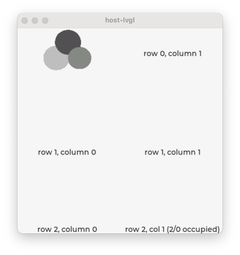
✅ Tip
To visualize real, calculated sizes of transparent widgets you can temporarily set
outline_width: 1on them.